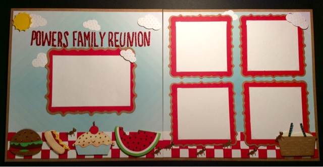
Every year, in June, my mom's side of the family has a family reunion. So to kick off this first Friday scrapbook day I thought I would create a double page layout (with room for four 4 x 4 photos and one 4 x 6 ) to showcase some photos from this past year.
For this layout I used 4 Cricut cartridges, 2 punches, 1 cuttlbug folder, 1 die, some thickers and lots of rhinestones.
So let's break it down one side at a time.
Let's start with the left-hand side. The sun in the upper left corner was it die from quick kutz and the clouds came from two different sized Fiskars punches (that I ran through the Cuddlebug Swiss Dots embossing folder). All the food at the bottom was cut from the Simply Charmed cartridge (hamburger – 2", hot dog – 1.5", pie – 2.5" and watermelon – 2") and the photo frame is from the Elegant Edges cartridge (the oblong burst cut at 6.75"). That fancy looking tablecloth (we do it up right here in the Midwest lol) was found on the Family Album cartridge. Now let me give you a tip so that you don't experience the same frustration I did the first 4 times I tried to cut the checkerboard pattern. The maximum size it will cut is 2 inches, but if you set the dial on an older machine (older than the explore) to 2 inches it will give you an error telling you it cannot cut because it is to big. There is a way around this, you MUST select the fit to page button and it will calculate to cut at 2 inches. (By the way, if you try to use the fit to length feature set at 11.75", it will give you an error). I cut a piece of white card stock to 2" x 11.75" in order to put behind the checkerboard piece, and added two of the pieces left over from the die-cut to the ends in order to get the full length. Gosh, I hope that made since.
For the title I used some Thickers from American Crafts in the font called Journal. Sidenote, why is it that you buy more and more Thickers (especially if they're cheap like they are at Tuesday Morning) because you don't have one to fit your project but then when you go to use them you realize you have too many to make a decision on Color or style to use. Does anyone else have this problem?
Lastly, I added different colored rhinestones to several of the foods (mostly to cover up the fact that some of them have a face when cut) which gives them a little sparkle and makes them stand out.
Now that we have covered the left side let's start with the right.
This side may look simple but it was actually most time-consuming part of the entire layout, all because of those stupid little ants. The frames once again are from the Elegant Edges cartridge (square burst cut at 5") and the tablecloth border is the same as the other side. I found the picnic basket on the Family Album cartridge (same page as the checkerboard piece and cut it at 2.5")
Now for those pesky little Ants, they were found on the Kate's ABCs and cut at 1.75" (I used a white Jelly Roll pen to add a dot for the eye), the hardest part was getting them to cut cleanly without ripping. The key to success is a very sticky mat and a sharp blade, otherwise be prepared to be annoyed and waste a lot of time and paper. For me, I felt the layout would have been to plain without them so I put up with the annoyance and gave it a try. I must've cut at least 30 but only these seven managed to survive.


No comments:
Post a Comment