Showing posts with label Double Page Layout. Show all posts

Wednesday, October 10, 2018

Lethal Luau Layout

I LOVE THIS LAYOUT!! I had so much fun creating this layout and I didn't even use the Cricut. I was able to dig through my large piles of embellishments and find enough goodies to fill both pages without it looking tacky (at least I hope ☺).

Stickers, chipboard shapes, rhinestones, and seashells...oh my.  (takes a short break to sing... ♫ I'm off to see the Wizard, the wonderful wizard of papercrafts (or Harry Potter)♫

When I was reviewing the photos that I was going to print for this layout I found that I had a couple of 'extra' photos that I wanted to include of other fun things that occurred that day, so I decided to add four additional wallet sized photo spots on the left hand side of the page where I would traditionally add more die cut images and decor. I really like this new look and I will probably stick with it going forward because in the end the photos on the pages should be the real stars instead of the images that were added.


And, for the last time...I covered all of the photos in my Halloween Murder Mystery Scrapbook so that the focus would be on the layout and not on the people and food. Plus, I didn't ask for permission from the guests to share their photos on my blog. 

Monday, October 8, 2018

Roman Ruins Layout

When it came time for me to make this layout I struggled BIG TIME! Absolutely zero ideas were coming to mind for an ancient Roman themed layout. I searched through the Cricut library of images for some inspiration but was shocked to find that there where hardly any Roman images. It is not as...detailed...as what I would typically make but I am still pretty happy with how it turned out.

I finally found this rather basic image of the Colosseum and made that my focal point on the left side of the page. Because I struggled so much with ideas for this layout, I ended up throwing it together the night before the 2016 Murder Mystery Party.


What do you guys think? What would you have liked to see for an Ancient Rome layout? Maybe I will try to replicate some of your ideas for another post. 

I covered all of the photos in  my Halloween Murder Mystery Scrapbook so that the focus would be on the layout and not on the people and food. Plus, I didn't ask for permission from the guests to share their photos on my blog. 

Friday, October 5, 2018

Murder on the Grill Layout 2

Hey guys and welcome back. Today we will be focusing on the second layout from my Halloween Murder Mystery Scrapbook mini-series. If you haven't read Monday's or Wednesday's post you should probably go check them out for more info on what the heck I am talking about.

Wednesday I told you that I had made two separate layout for the 2014 party, Murder on the Grill. The reason that I did this was because after I added all of the images to the first layout there simply wasn't any room for the photos of each character that I wanted to include.

On the day of the party, as my guests arrived, I snapped a quick photo because I knew that doing a scrapbook of each character would be fun. In order to save room for more images (which were all once again cut from the Cricut Nifty Fifties Cartridge) I printed each photo in wallet size. Plus, doing this gave me a duplicate photo (since you have to print two of the same photo together when you print wallets at Walmart) in case I messed up when I was cutting the photos apart. In the end I just gave the duplicates to each guest the next year when they came for the next party.


I once again busted out my trusty label maker so that I could add each guest's character's name below their photo. Also, if you look closely (in the photo of the hamburger, milkshake and soda) the patterned paper that I used for the background of the photos (and to put the label on) is this really cool vintage radio paper that fit really well with the theme. 

I covered all of the photos in  my Halloween Murder Mystery Scrapbook so that the focus would be on the layout and not on the people and food. Plus, I didn't ask for permission from the guests to share their photos on my blog. 

Wednesday, October 3, 2018

Murder on the Grill Layout 1

When I was in high school I was lucky enough to fall in with a group of friends that liked to get together often and play games, watch movies or go out to eat. Man those were the days. One year, around New Years, one of my friends hosted a murder mystery game and I was invited to participate. I LOVED it!! We all had such a blast that night that I wanted to replicate it by hosting my own party. I went out and bought two different boxed murder mystery sets at two local stores (that was back when they could still be purchased locally) but alas my friends and I never got around to doing another mystery game night because soon after that night they graduated (they were two years older than me) and several of them went off to college in different states.

Flash forward about twelve years to 2014. My best friend had just got married in August and moved back into town. For the first time I could gather together the right number of players to host my own murder mystery party. I went into my game closet and dusted off the boxed mystery kit from so long ago and started making plans.

To say that I went overboard that first year would be an understatement! It was the first party that I had ever hosted and I was extremely excited. There were so many ideas flooding into my head, between the multitude of Halloween themed decorations and food and the 1950's theme of the party that it was extremely hard to narrow it down. But, there will be an entire post about the food and decor for each party coming soon so I wont elaborate too much right now.

I actually made two layouts for the first year (all the rest only have one) because I had so many photos and images that I wanted to include. Today we will talk about the first page and then Friday's post will be about the second.


The first layout from 2014 came about as a way to use some of the diecut decorations that I had used during the actual party. The drive in sign was placed on the door leading from the living room to the basement, it served no purpose but was a way to add some themed decor to a blank space. Both the car (before it was cut in two) and the body shop words were adhered to the glass of the door leading out into my garage, as a fun play on the fact that cars typically live in the garage and as a way to cover the window so that my guests couldn't see the MESS that is in my garage. Lastly, the large jukebox diecut was adhered to the speaker I was using to play music (I created a custom playlist on Spotify) and the CD that came with the game. All of the images were cut from the Cricut Nifty Fifties Cartridge and I used my label maker to add the party info to the movie marquee and the year to the license plate of the car. 

I added two photo mats to the page to show the different foods that I served. 

I covered all of the photos in  my Halloween Murder Mystery Scrapbook so that the focus would be on the layout and not on the people and food. Plus, I didn't ask for permission from the guests to share their photos on my blog. 

Friday, April 21, 2017

Wedding Album 6- Mr. & Mrs. Celebrate

Hey peeps, it is finally Friday and the wedding album series is almost done.
First things first the disclaimer, this album is HEAVILY inspired by a series of layouts that I saw on YouTube awhile back by an extremely talented scrapbooker named Faith Abigail. I fell in love with her work and wanted to adapt her layouts to fit with my needs and my supplies. I kept some of the same elements but changed it up where needed.
Alright now that that is done, let’s get to taking about pages 10 and 11 of the album. These two pages are intended to showcase photos from the reception. Six 3 x 3 photos will line the outside edges and two 4 x 6 photos can be placed in the center of each page.

The die cuts are classic receptions icons, the Mr. & Mrs. for the first time that the new couple is announced. A beautiful three tiered wedding cake with rhinestone accents. Two matching goblets for the couple’s first toast. The word Celebrate should be self-explanatory and lastly two gifts are placed at the top as presents to the newly wedded couple.

UPDATE: Hey guys, it is a little bit later in the day but I just had to come back and tell you that I just went onto Vistaprint and ordered my very first, OFFICAL, business cards! I am so happy, I can't seem to stop smiling. Shipping will be about 10 days, which is torture, but when they do finally get here I will definitely share them with you!

Tuesday, April 18, 2017

Wedding Album 5- I Do

Hey Guys, I hope you had a good weekend. Today we will be continuing with the wedding album series that we started last month and be covering pages 8 and 9 of the album.
Once again for the disclaimer, this album is HEAVILY inspired by a series of layouts that I saw on YouTube awhile back by an extremely talented scrapbooker named Faith Abigail. I fell in love with her work and wanted to adapt her layouts to fit with my needs and my supplies. I kept some of the same elements but changed it up where needed.
This double paged spread is perfect for photos of the happy couple as they walk down the aisle, say their vows and for the first kiss as husband and wife. There is space for three 4 x 6 photos (two landscape and one portrait) and for a single 4 x 4 photo. The words “tying the knot” and “I Do…” help to convey the style of pictures that will be displayed.
The left side of the layout features a large “wedding” bell that can easily be customized to the couples color scheme, as well as a pair of wedding rings in which the brides ring is full of rhinestones to provide a lot of added sparkle.

The right side of this layout contains one of my personal favorite die cuts in the album. A Silhouette of the bride and groom. The brides dress is embossed to show a lace like texture and adorned with pearls down the back as buttons. A necklace of rhinestones encircle her neck as well as her hair up do.

Tuesday, April 4, 2017

Wedding Album Day 4- Bridesmaids and Groomsmen

I am really excited to share today's layout with you! If you have been following along with this series this is pages 6 & 7 of the wedding album that I made for the family member of a friend of mine.
As I have stated in each blog post, this album is HEAVILY inspired by a series of layouts that I saw on YouTube awhile back by an extremely talented scrapbooker named Faith Abigail. I fell in love with her work and wanted to adapt her layouts to fit with my needs and my supplies. I kept some of the same elements but changed it up where needed.
These two pages though are entirely my own. I created this layout for the album that I made when my best friend Heather got married several years ago. I was the maid of honor in her wedding and wanted a place that photos of us could be showcased. This layout can be customized to accommodate the number of Bridesmaids and Groomsmen that are in the wedding as well as the colors featured in the wedding.

For this particular album I was told that the Bride and Groom each have 4 people standing up with them which fit perfectly across the top and bottoms of the pages.
(On the previous version of this page that I made the Bride and Groom only had 3 Bridesmaids and Groomsmen, so instead I replaced one of the bridesmaids and one of the groomsmen with die cuts of a Bride and a Groom.

This layout has a lot of room for pictures and features spots for two 4 x 6 photos and six 3 x 3 photos. Once again each photo mat has photo corners added so that the recipient doesn't need glue to add their photos onto the layout. 

Friday, March 31, 2017

Wedding Album Day 3- The Bride and The Groom

Hey hey it’s Friday and I am on a roll. Believe it or not I have yet another page from the Wedding album COMPLETE. I have to say, I am really proud of myself for getting so much done, so quickly. If you are new to my blog be sure to check out the previous posts in this wedding album series. First and foremost the disclaimer, this album is HEAVILY inspired by a series of layouts that I saw on YouTube awhile back by an extremely talented scrapbooker named Faith Abigail. I fell in love with her work and wanted to adapt her layouts to fit with my needs and my supplies. I kept some of the same elements but changed it up where needed.
Today is all about pages 4 and 5 of the album and they are all about the BRIDE and GROOM as they get ready for that life changing walk down the aisle. This double page layout provides a lot of places for photos- there is room for two 4 x 6 photos and six 3 x 3 photos. Let’s talk about the left side of the layout first which is all about the Bride. Aside from the spaces for photos there are several bridal themed die cuts that help paint a picture of what photos will be placed on these pages. There is a high heel with a heart (that can easily be customized to the wedding colors), a bouquet that stand out with several layers of dimension (which is also customizable), a wedding veil that is covered in rhinestones and finally a beautiful wedding dress in the center that is embossed for added texture and dimension with rhinestones added to the base of the dress and a colored ribbon added around the waist (which is once again customizable.)

For the Grooms sided of the layout I have placed a man’s dress shoe with a black cording as the laces for a more realistic look, a tall top hat with a customizable band in the wedding colors and lastly a black tuxedo with a bowtie that fits with the colors.   

Tuesday, March 28, 2017

Wedding Album Day 2- Our Wedding

I am back today to share another page in the Wedding album that I am making for a family friend. Before we get started here is my brief disclaimer: this album is HEAVILY inspired by a series of layouts that I saw on YouTube awhile back by an extremely talented scrapbooker named Faith Abigail. I fell in love with her work and wanted to adapt her layouts to fit with my needs and my supplies. I kept some of the same elements but changed it up where needed.

Ok now that the boring stuff is out of the way let’s get back to the album. This week I am sharing pages 2 and 3 with you. They are titled Our Wedding and feature a city scape outline in the background with a church and a white limo in the foreground. Four different photo mats are located at the bottom ready to hold four 4 x 5 inch photos. These pages would be great for photos of the church or of the bride and groom on the way to the church to get ready or so many other great pictures. 

Friday, July 8, 2016

Have a BLAST

Hey guys, it's Friday!! I hope you have all had a good week. People are still shooting off fireworks in my neighborhood but at least by now they are are stopping around 11 pm so it is easier to get some sleep. They are beautiful to look at but annoying when you are trying to sleep.

Since Monday was July 4, aka Independence Day, I thought that I would share a patriotic themed layout with you this week. And, I have to tell you I am completely in love with how this layout turned out!!


For this layout I was loosely inspired by a single page layout I saw on youtube/pintrest by one of my favorite scrapbookers, Faith Abigail Designs. She used SVG files that she bought online to create her layout, but I decided to test myself to see if I could recreate a similar layout only using supplies I already own. It took a little time but in the end the result is WAY better than I anticipated!! 

I was able to use a coupon that gave me a free trial of the Cricut subscription service,so I had even more cartridge options available to me. It is definitely something I am considering subscribing to but that will have to wait for awhile (aka when I have money). In the end I used three cartridges that I own (Teddy Bear Parade, Stand and Salute and George an Basic) and only two that I don't (Old West for the barrel and Independence Day for the wagon and flag banner.)

I hope that you all enjoy this layout as much as I do and that you had a happy and safe 4th of July!!

Friday, February 5, 2016

Birthday Double Page Layout

Hey peeps, it's that time again. 

This weeks layout is a little bit busy but I'm loving how it turned out. And, since it is a layout to showcase some of my own birthday photos from last year my opinion is the only one needed. (Although I hope you guys like it too)


For this layout I used a LOT of different products. In order to keep this post from being considered "boring" because of all the particulars, I'm not going to list everything. If you have any questions please feel free to ask, I might even have an answer. 


Have a great weekend and I'll see you back here Monday. And, as always, please comment below with any feedback, questions, critiques or requests. 


Saturday, January 23, 2016

Superhero Layout

Hey peeps! To start off today's post I want to make two apologies. 

The first, is that I am sorry my previous posts this week have been so short. For some reason this week I have been feeling majorly uninspired and living too much in my head, which makes for bad blog posts. I recently received my first bit of constructive criticism about my blog posts, I was told that at times it reads as dry and boring – I need to add more of my own personality into each post. Of course this has led me to overthink every word that I write and question whether or not I'm being funny. I've come to the realization that I must be "accidentally funny" because when I try it comes off as forced an unbelieveing. So I now have something (else) to work on. 

The second apology that I need to make is that this post is a day late, I had it done in plenty of time to upload but last night I suffered from a major headache and actually went to bed really early. I don't know if it was due to my "lack of sleep" the night before (I went to bed, woke up two hours later and couldn't get back to sleep, I have sleeping issues – don't judge lol) or if it was the fact that my back has been hurting and I'm too chicken to get a massage or to see chiropractor. I hope you all can forgive me. 

Now enough of this rambling, let's get to the layout. As the title says this week is a superhero themed double page layout. Last June, my niece celebrated her fourth birthday with a superhero themed party. She absolutely loves Wonder Woman and looked adorable in her costume. I went through the photos that I had from the party and I knew that I wanted to put a lot of them on this layout. That is why this layout features six 4 x 6 photo mats and one 4 x 4.


Since I wanted the focus of this layout to be about the pictures I tried to keep the design pretty minimal. I used to Cricut Plantin Schoolbook to cut the cityscape (this is one of my favorite cuts from the entire cartridge, I've used it many times) and I cut it using the "fit to page" feature on my expression. Even at the maximum size the city will not cut the entire length that you will need it, it is about a quarter of an inch short. I'll tell you how I fix this problem soon. 

I used the Cricut Create a Friend cartridge to cut my super hero girl. The actual cut is a Super boy but because so many elements of this cartridge are interchangeable I was able to simply find another hairstyle and turned the boy hero into a girl hero. I cut her out at 6 inches so that she could be the major focal point of the page. Just a little sidenote, if you're familiar with the cartridge you'll know that I added a little red piece around the neck to simulate the tie from the Cape, not only does it add a little bit of uniqueness to the character but it was also to hide one of my own mistakes. As I was adding glue to the body during assembly I almost tore our hero's neck off and didn't want to recut the entire thing. So by cutting a tiny piece of red card stock and adding it to that area I was able to mask the fact that I almost decapitated my focal point.

Now, since the birthday girl dressed as Wonder Woman, I wanted to stick with those colors throughout the layout (Plus, most superheroes share the same color combos anyway – red, white, blue and gold). The pattern papers actually came from a patriotic themed paper pad from Pebbles called Americana. Although you can't see it very well, there is a piece of gold(ish) cardstock that separates the red and blue pattern papers and it is punched using the Fiskar's Upper Crest border punch. I did this to mimic wonder woman costume which is a red top, a blue skirt and a golden belt. 

I mentioned above that the cityscape cuts just shy of the length that you need it, to solve this problem I grabbed a punch from American Crafts called Scalloped Star (it is one of the knockout punches and a part of a Christmas set of six different punches – I got it on sale at Tuesday Morning a while ago ) and I added it to the edges to cover the gap. 

To finish up the page I went through my bin of Thickers and other alphas (man is that bin scary, I just may have too many alphabet stickers LOL, but you just have to have one in every color right?) and i found that I had the same font (freedom-which is kind of fitting if you think about it) in both a red and a blue. 

Lastly, because I hate blank space, I went into my sticker/die-cut/other randomness bin and found a package of superhero themed diecuts from Recollection. I cut apart one of the frames in the pack to get the sentiment "Super Hero" and added it to a red "burst" that was also included. 

I hope you all like it and found this post to be both informative and "less dry and boring". If you have any feedback I would love for you to tell me by posting in the comments. I hope you have a fantastic weekend and I will see you back Monday with the conclusion to our Christmas 2015 card flashback. 


Friday, January 8, 2016

Happy Friday

Hey guys, I hope you all have had a great Friday. Today completes the first week in my crafting resolution series, and I'm super shocked that I managed to actually stick with it. Now, most of you are probably thinking a week is not that hard, but since the weight loss/ diet resolution that I set for myself hasn't managed to make it past six hours I am going to celebrate this small victory!

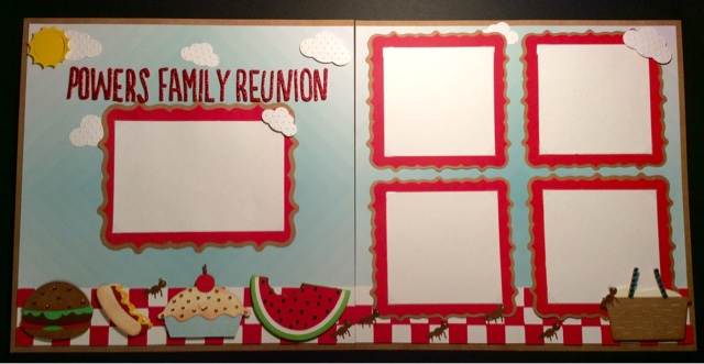
Every year, in June, my mom's side of the family has a family reunion. So to kick off this first Friday scrapbook day I thought I would create a double page layout (with room for four 4 x 4 photos and one 4 x 6 ) to showcase some photos from this past year. 


For this layout I used 4 Cricut cartridges, 2 punches, 1 cuttlbug folder, 1 die, some thickers and lots of rhinestones. 

So let's break it down one side at a time. 


Let's start with the left-hand side. The sun in the upper left corner was it die from quick kutz and the clouds came from two different sized Fiskars punches (that I ran through the Cuddlebug Swiss Dots embossing folder). All the food at the bottom was cut from the Simply Charmed cartridge (hamburger – 2", hot dog – 1.5", pie – 2.5" and watermelon – 2") and the photo frame is from the Elegant Edges cartridge (the oblong burst cut at 6.75"). That fancy looking tablecloth (we do it up right here in the Midwest lol) was found on the Family Album cartridge. Now let me give you a tip so that you don't experience the same frustration I did the first 4 times I tried to cut the checkerboard pattern. The maximum size it will cut is 2 inches, but if you set the dial on an older machine (older than the explore) to 2 inches it will give you an error telling you it cannot cut because it is to big. There is a way around this, you MUST select the fit to page button and it will calculate to cut at 2 inches. (By the way, if you try to use the fit to length feature set at 11.75", it will give you an error). I cut a piece of white card stock to 2" x 11.75" in order to put behind the checkerboard piece, and added two of the pieces left over from the die-cut to the ends in order to get the full length. Gosh, I hope that made since. 

For the title I used some Thickers from American Crafts in the font called Journal. Sidenote, why is it that you buy more and more Thickers (especially if they're cheap like they are at Tuesday Morning) because you don't have one to fit your project but then when you go to use them you realize you have too many to make a decision on Color or style to use. Does anyone else have this problem?

Lastly, I added different colored rhinestones to several of the foods (mostly to cover up the fact that some of them have a face when cut) which gives them a little sparkle and makes them stand out.

Now that we have covered the left side let's start with the right. 


This side may look simple but it was actually most time-consuming part of the entire layout, all because of those stupid little ants. The frames once again are from the Elegant Edges cartridge (square burst cut at 5") and the tablecloth border is the same as the other side. I found the picnic basket on the Family Album cartridge (same page as the checkerboard piece and cut it at 2.5") 

Now for those pesky little Ants, they were found on the Kate's ABCs and cut at 1.75" (I used a white Jelly Roll pen to add a dot for the eye), the hardest part was getting them to cut cleanly without ripping. The key to success is a very sticky mat and a sharp blade, otherwise be prepared to be annoyed and waste a lot of time and paper. For me, I felt the layout would have been to plain without them so I put up with the annoyance and gave it a try. I must've cut at least 30 but only these seven managed to survive.